Hello all! I am so happy to be able to share my final challenge for level 2 in Altenew Educator Certification Program (AECP).
The challenge was to make four masculine cards and one upcycled project from the classes I have taken for AECP level 2. I chose the Polychromatic class playing with multiple colors, the Stencil Techniques class using different stencil techniques and finally All About Layering that inspired me to use my layering stamps on one of my cards.
I wanted to have one color palette throughout the challenge. I started out figuring out which colors to use and also some products I wanted to include.
This was my color scheme of Altenew Crisp Dye Inks for the challenge: Caramel Toffee, Vanilla Cream, Misty Morning and Nimbus (in the end I also added some Dark Night).
Before I started I had a loose plan for each of the cards. As always, things turn out a little bit different in the end - I believe that's part of the fun!
For my first card I wanted to play with multicolored stamping and Illusion Diamonds Stamp Set. I used Altenew Crisp Dye Ink in colors according to my color scheme. I placed the stamp in my MISTI and added the first ink color to my stamp. I added ink only to the top part of the stamp, making sure I angled the ink pad to make an even color transition.
I added the next colors the same way until I was happy with the result.
I was not too happy with the evenness though, so I wanted to keep the beautiful background yet cover it up with my other elements. I picked letters from the lovely
Mighty Alphabet Die Set and die cut CONGRATS both in white cardstock and
white fun foam. Keeping the foam letters still in their sheet I used liquid adhesive to glue the cardstock letters to the foam letters.
I planned my design and my letters to cover up some of the unevenness of the background. I also wanted to keep the card simple to make the beautiful colors stand out.
In order to give the card some weight and contrast I added a strip of deep blue cardstock at the bottom with a white heat embossed sentiment. In the end I was happy with how this clean and simple card turned out.
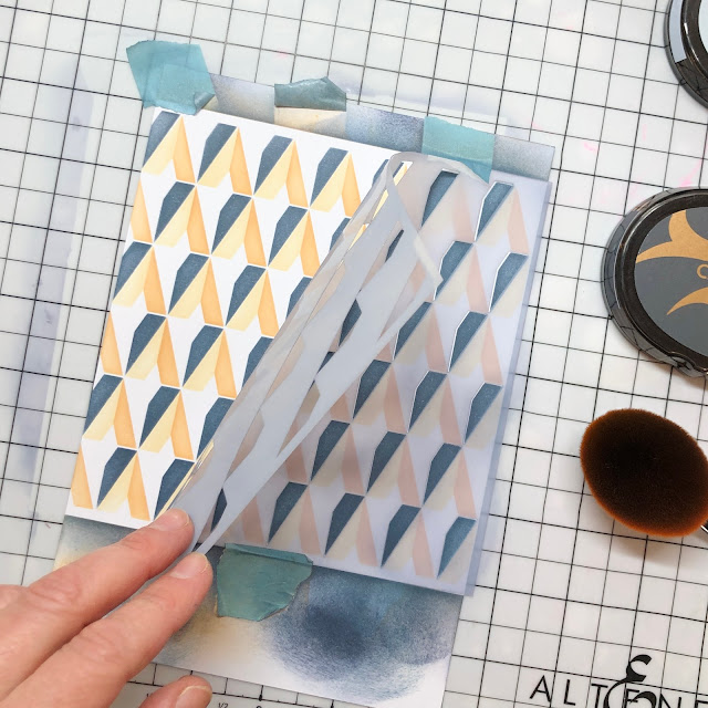
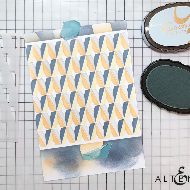
My second card was a LOVE card with a fun layered stencil technique. I used the Diamond Builder Stencil with the same colors as the first card: Vanilla Cream, Caramel Toffee, Misty Morning and Nimbus (in the end I also added Dark Night for even more contrast).
For this particular stencil I wanted to get the position exact right so I taped the stencil to the paper for each of the colors.
I also planned the colors so that the two darkest colors was facing the same direction. This would enhance the 3D-effect.
I cleaned the stencil between each color and taped it down again. The packaging has a great guide, so positioning the stencil correctly is quite easy.
When the background was completed I die cut LOVE letters from
Bold Alphabet Die Set twice. I wanted simple, bold letters on the impactful background. I glued the two layers together to get more sturdy letters.
I stamped HELLO from Mega Label Love Stamp Set with black ink and cut it to coordinate with the height of the letter l. I adhered it along the left edge and added the LOVE letters on foam tape in the extension of this.
Finally, to tie everything together, i span some black and white twine around the card front and added three small enamel hearts for some shine.
My third card was an ANNIVERSARY card. I wanted to have a floral element not too feminin and I figured the sprig from
Floral Sprig Stamp Set would work well.
I stamped the motive with black permanent ink. I used the coordinating stencils to add colors to the sprig. For the greenery I used Limestone Crisp Dye Ink and for the flowers I used Vanilla Cream, Caramel Toffee and Milk Chocolate Crisp Dye Ink.
When I was done coloring I die cut the sprig with the coordinating die.
I planned out my card design and stamped my anniversary greeting in black ink. To make a soft background for my sprig I ink blended the center of the card front with a light touch of Misty Morning Crisp Dye Ink.
I added the sprig on foam tape and glued it to the card front. For my additional sentiment I heat embossed CONGRATULATIONS in white on deep blue cardstock and added it on foam tape just above my first sentiment. For a final touch I added three
enamel dots in a coordinating color.

The last of the four main cards was an ENCOURAGEMENT card. I used the
Vintage Vibes Stamp Set with coordinating dies and coloring stencil. I stamped the television with the different layers according to the stamping guide and used the coordinating stencil to add color to the screen. I die cut my stamped tv and die cut another one to adhere to it for more stability.
I ink blended the background through
Classy Stripes Stencil using Vanilla Cream Crisp Dye Ink. I stamped my sentiments below it with black ink.
Finally I added the tv to the card using foam tape, and also som black and white twine to pull everything together.
My UPCYCLED ITEM is an encouragement card made out of wallpaper scraps. I renovated my store some years ago and could not throw away the leftovers as I love the flower design! Transforming the scraps into beautiful cards seems like the perfect way to use up the wallpaper leftovers.
I started out cutting out the parts of the design I wanted to use, some large flowers and lots of small ones.
I planned my card design and cut the large flowers to fit the card front size. I added the smaller flowers and leaves in between the large ones. To add dimension I used foam tape for some of the flowers.
Finally I added pearls in the flower centers and some gold thread for a little extra shine and detail..
Finally all of the cards together:
I loved this challenge and I hope you liked the projects!
Thanks so much for visiting!


Absolutely gorgeous work, Berit! You did an incredible job. I love your cards and that wallpaper is to die for!
SvarSlettThank you, Erum!
Slett